AMOREPACIFIC
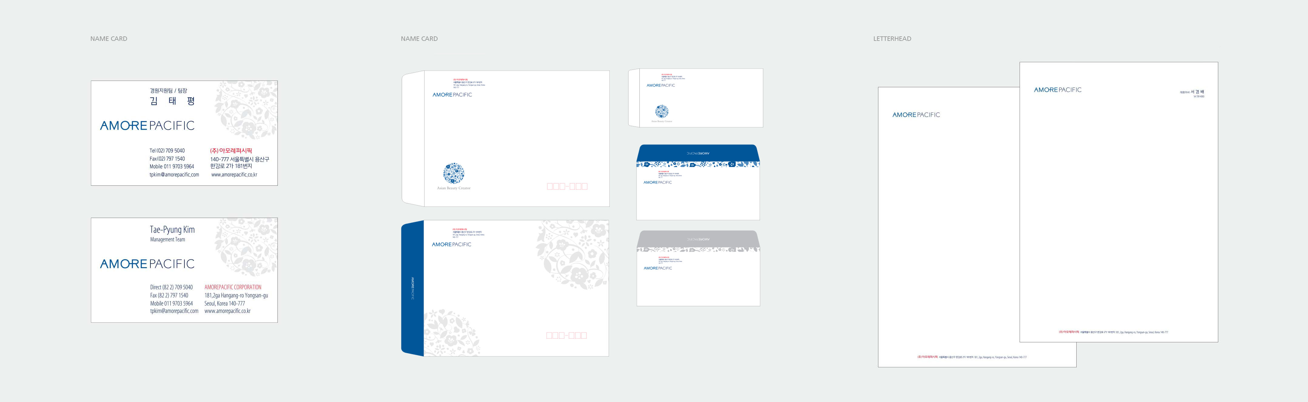
In order to become Amore Pacific as a global brand, Citrus has conducted a total consulting of brand identity for Amore Pacific through progressing prognosis of brand and repositioning. Citrus has formulated the design guidelines for the brand communication through establishing a definition of core values and design spirit of Amore Pacific. We developed and applied brand motif (interior and sign) and redesigned CI design (Hangeul logo etc.). The design strengthened Amore Pacific’s corporate image of Asian beauty creator.
ClientAMOREPACIFICServicesBranding
 PROJECT?GOAL & OUR APPOACH
Citrus attempt to deliver Amore Pacific’s core value to end users well.?Therefore, through a combination of single-name, symbol and the slogan, it was to be able to customers immediately recognize the brand.?In addition, through applying the designs, we attempt to deliver not only the technical capabilities of Amore Pacific but also the core value to their customers.
OUR SOLUTION
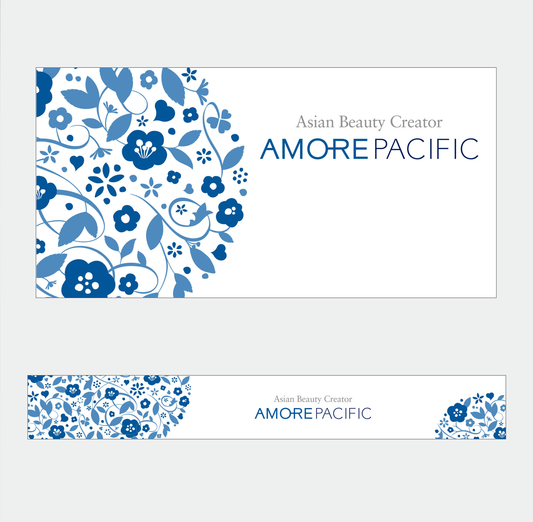
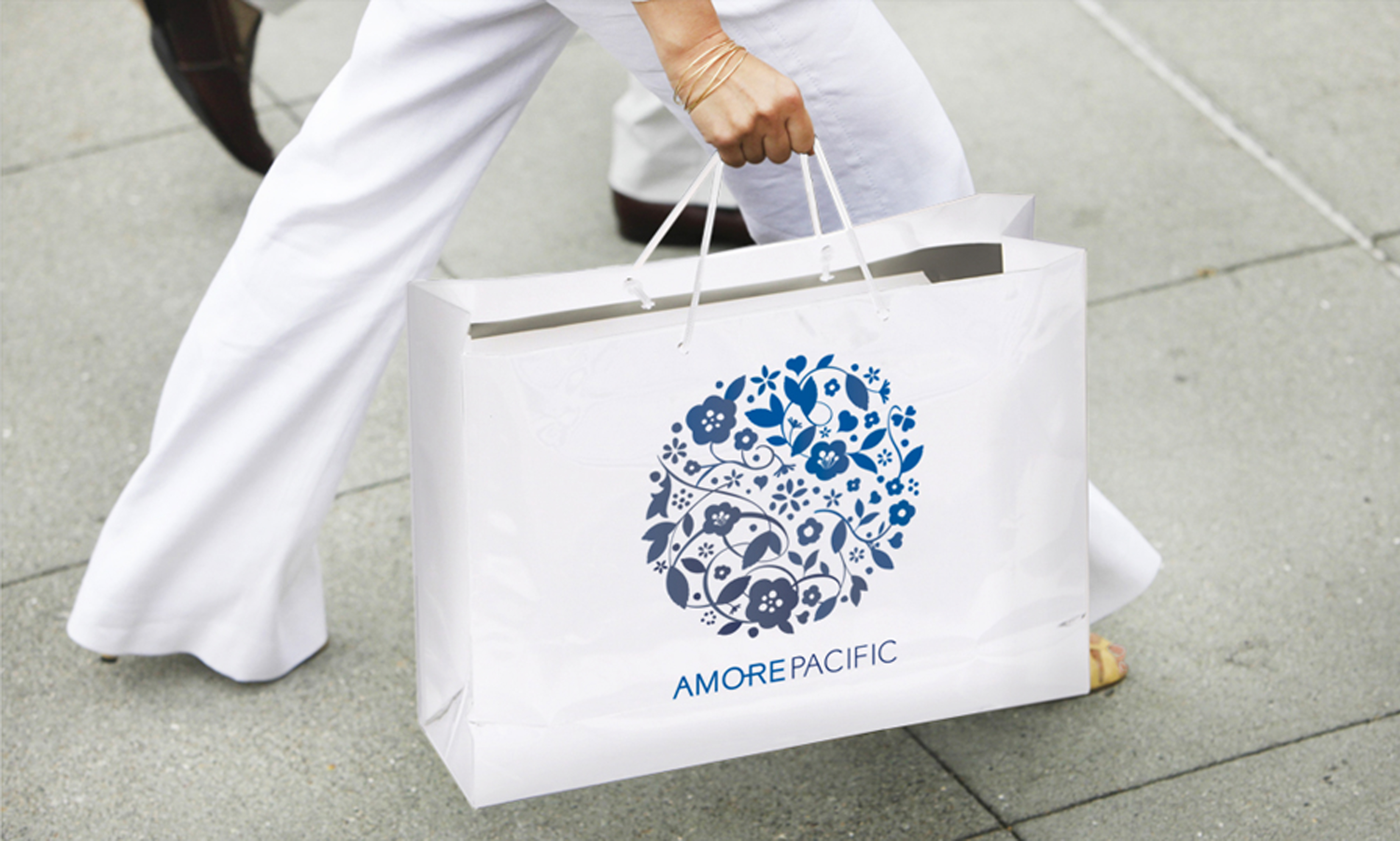
The symbol conveys Amore pacific’s 61years history and vision towards the World’s health & beauty. The monogram that represents the Asian Beauty Creator expresses the long history of AmorePacific as well as its pioneering spirit.?The shape of heart represents beauty and love and at the same time it also represents the creator of Asian Beauty.?PACIFIC BLUE symbolizes the history and spirit of challenge of the Pacific Ocean.
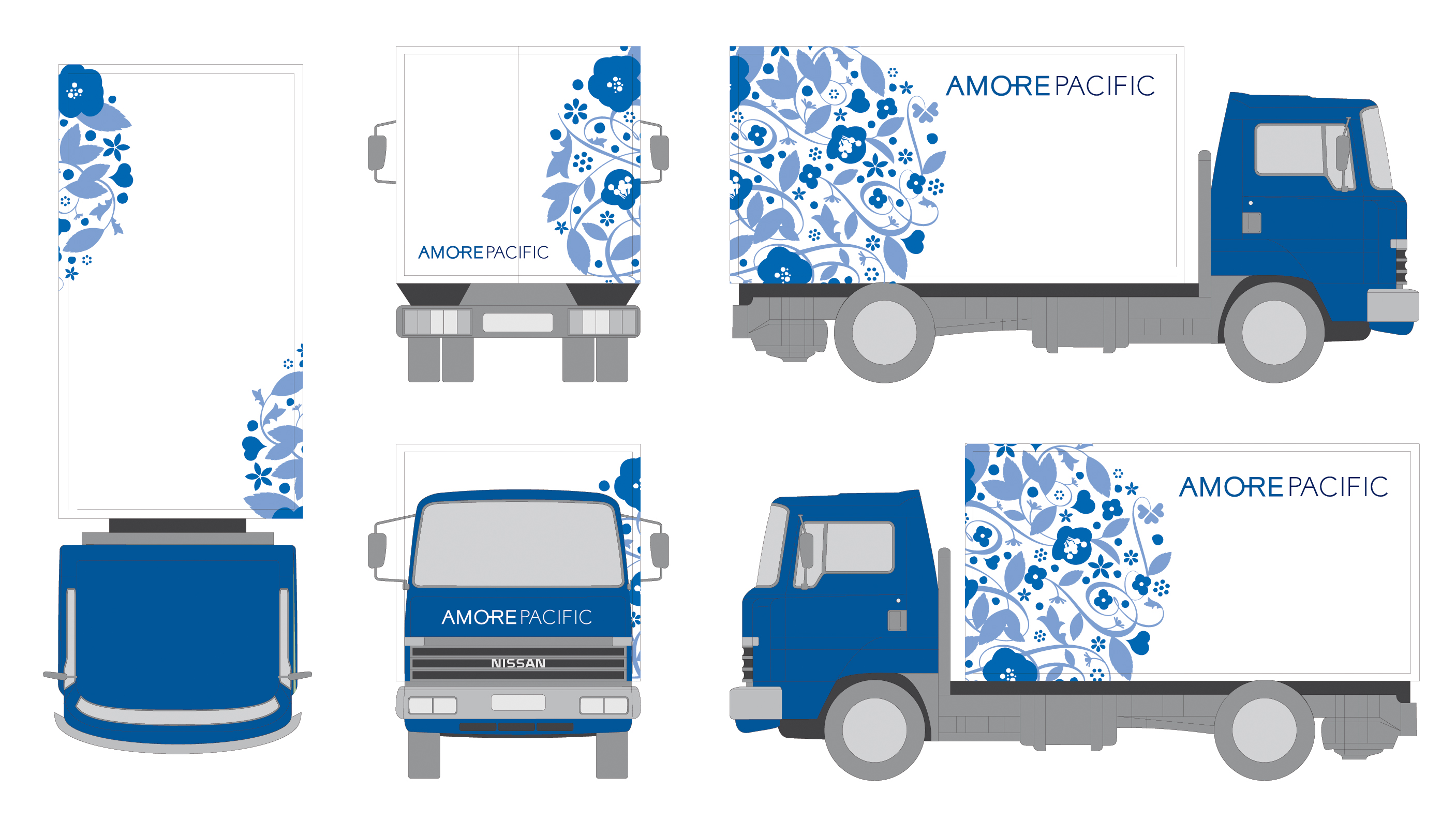
The harmony of various graphic designs represents Amore Pacific’s flourishing world from various fruitions that through the history of camellia, the pioneer spirit of green tea and creativity for the future. This pattern of camellia, green tea, beans, and ginseng signifies AmorePacific’s corporate vision to make the world a more beautiful and abundant place.
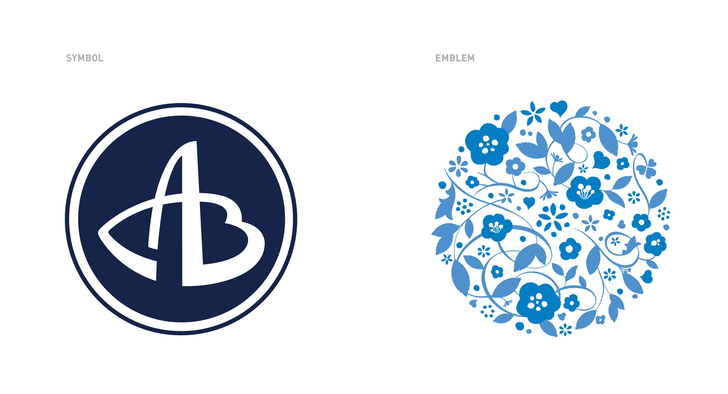
The soft, sophisticated, and feminine image of AMORE meets the strong, entrepreneurial, and masculine image of PACIFIC in ‘AmorePacific’ to express the perfect harmony of contrasting qualities: inner beauty with outer beauty; traditions with the future; emotion with reason; and nature with science.
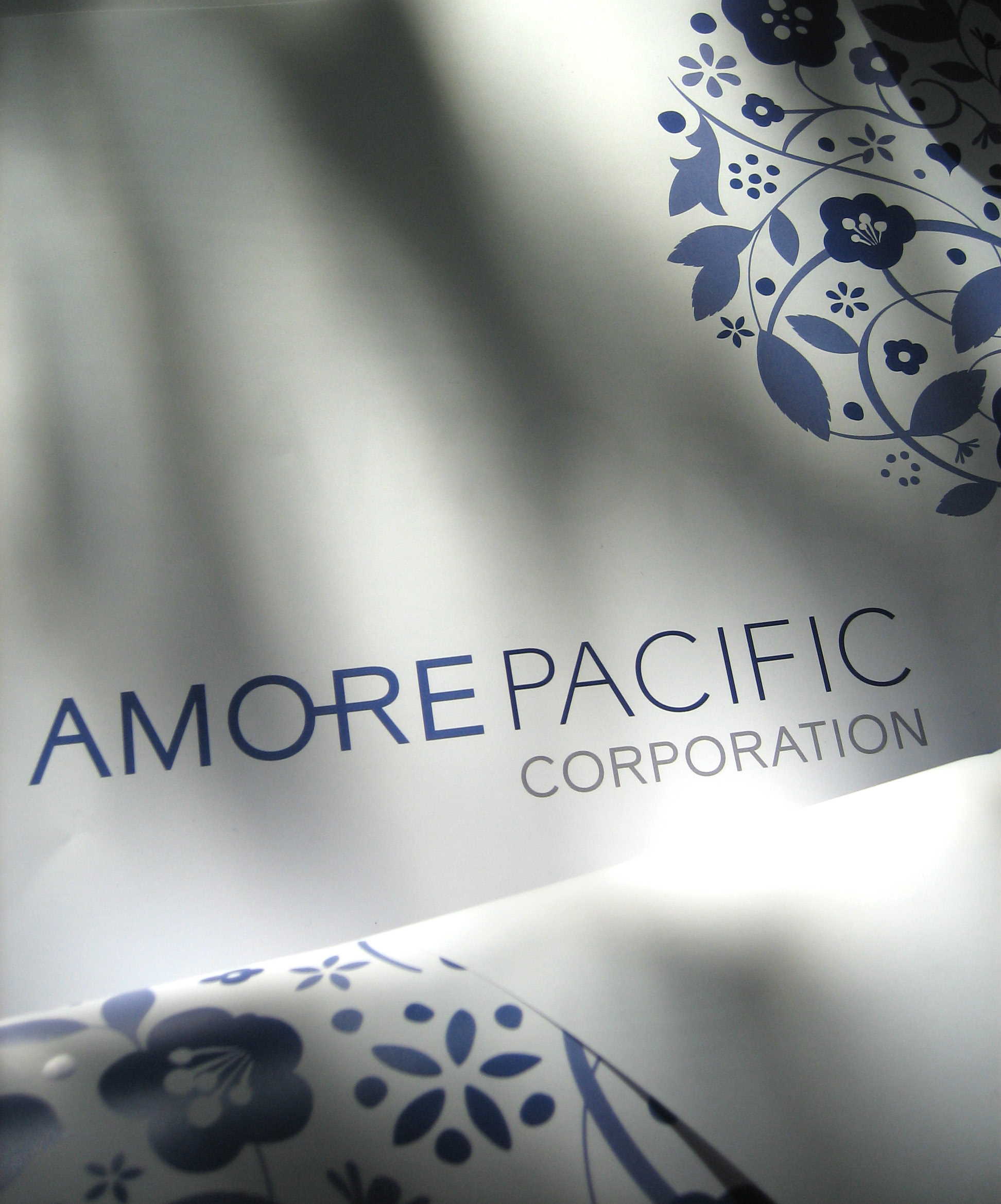
“Pacific Blue” that used as the main color for the Amorepacific’s C.I. gives an impression of aggressiveness and progressiveness, and also the color is contextually related to the company’s brand name. “Metalic Silver” that applied to the edge of the symbol represents sophistication upon global perspective
![]() ?
?
![]()