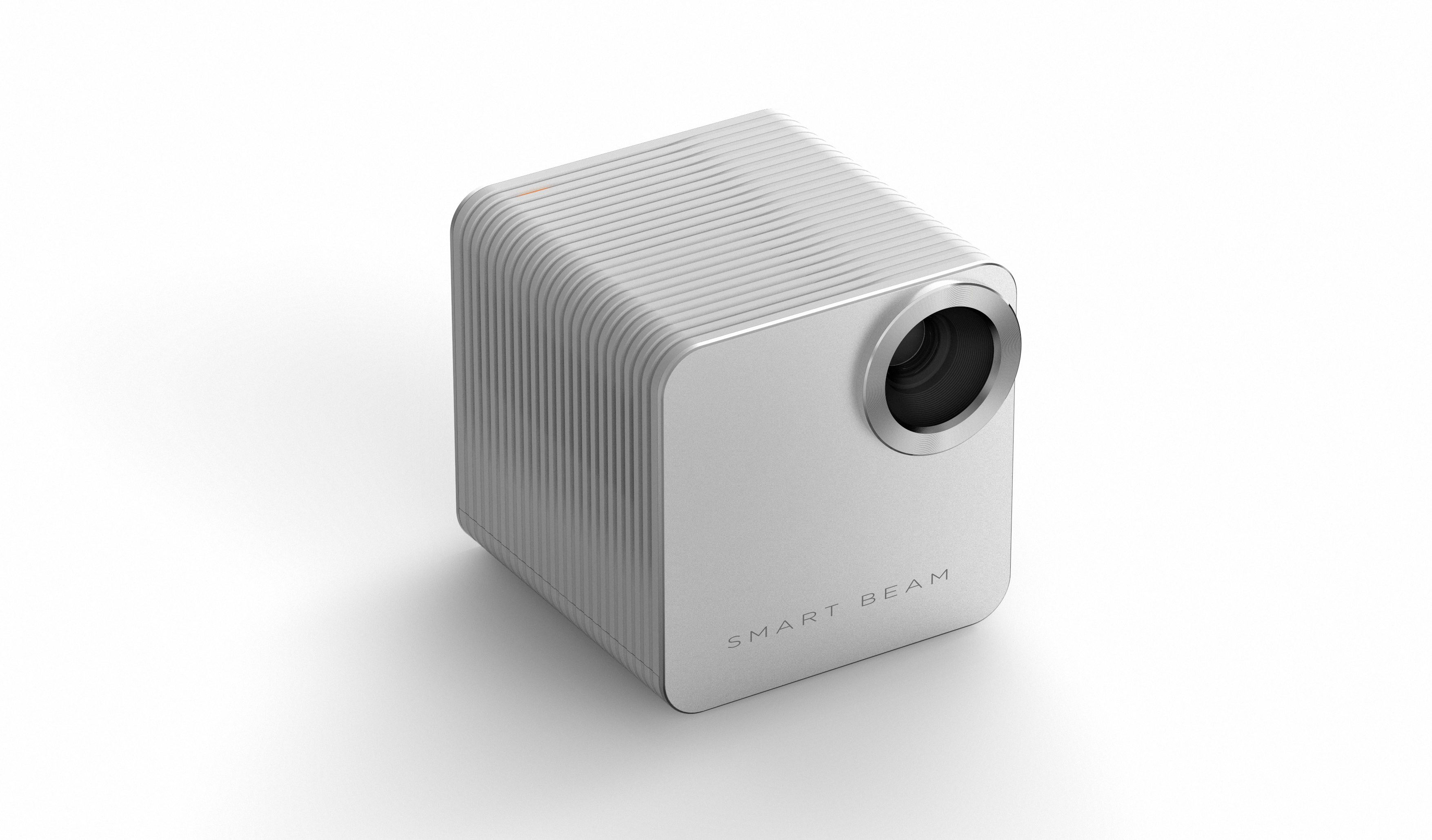
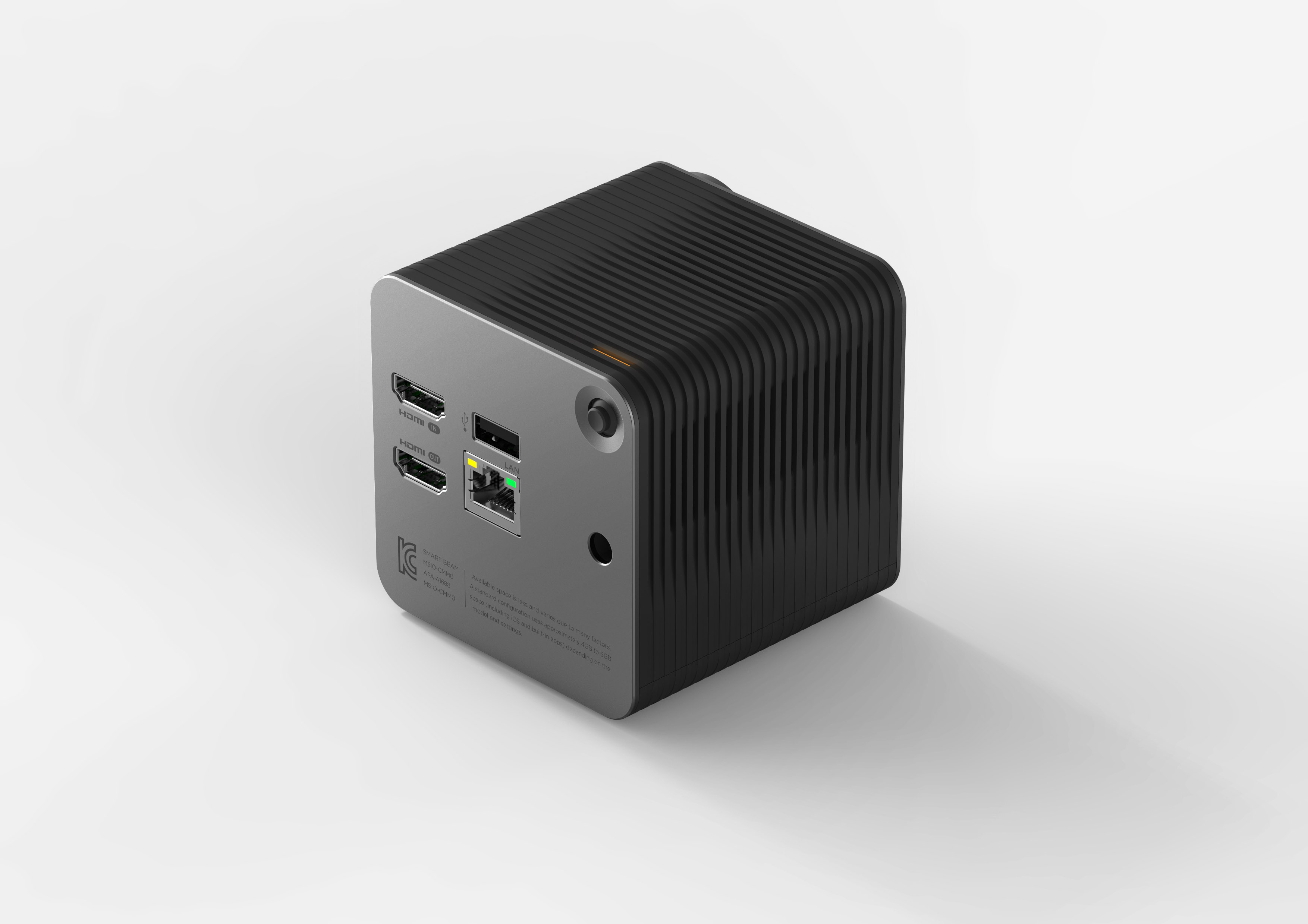
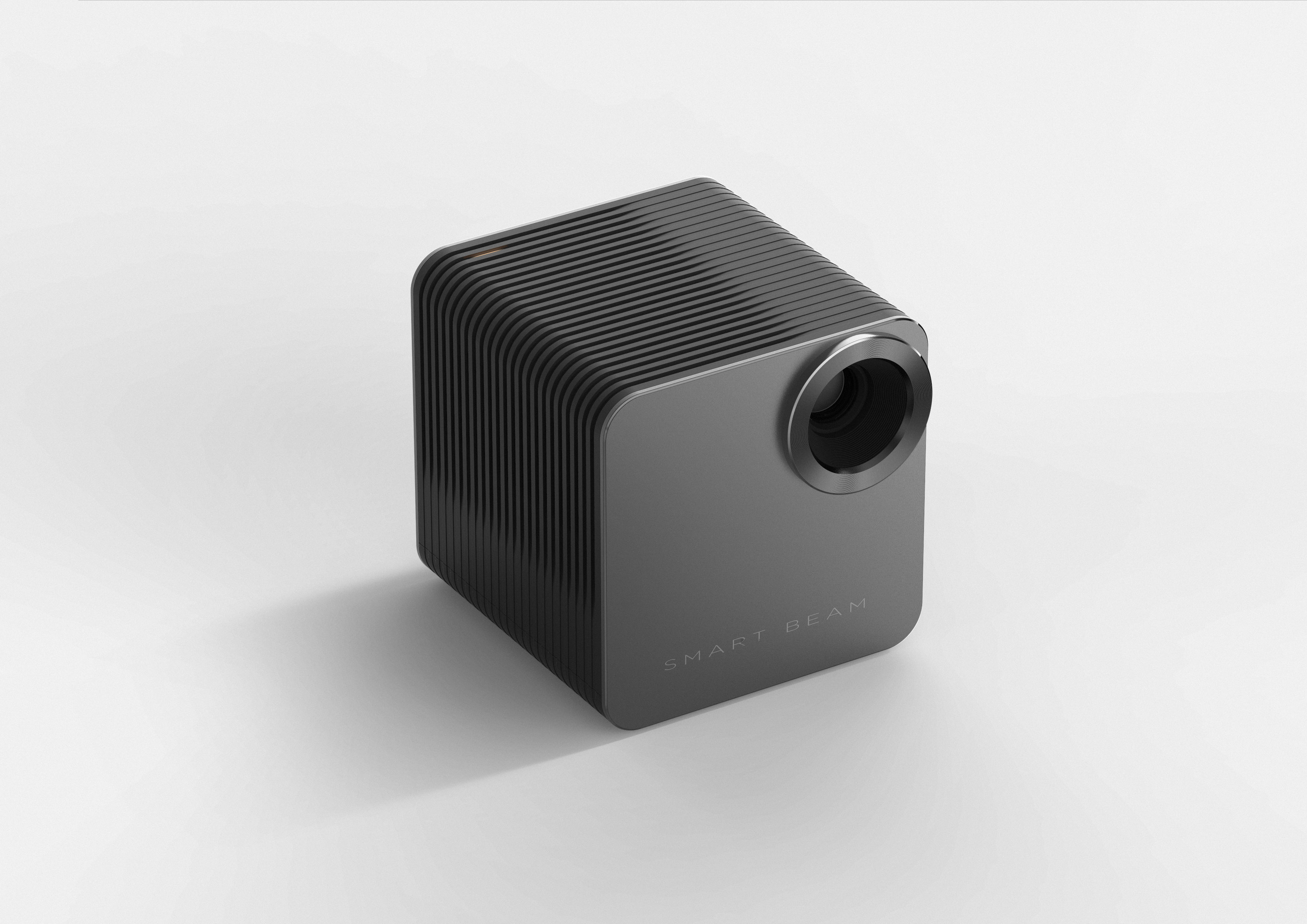
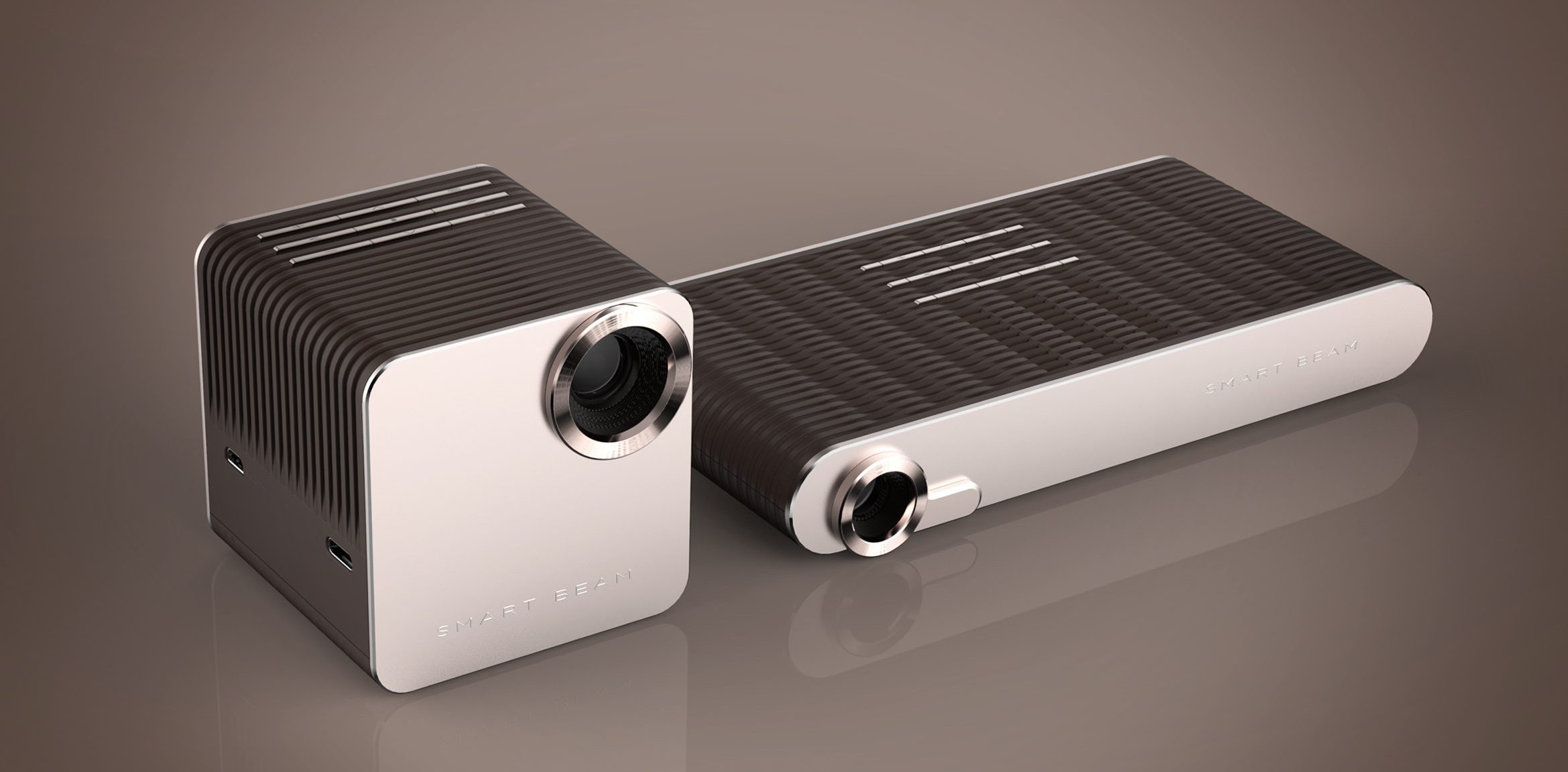
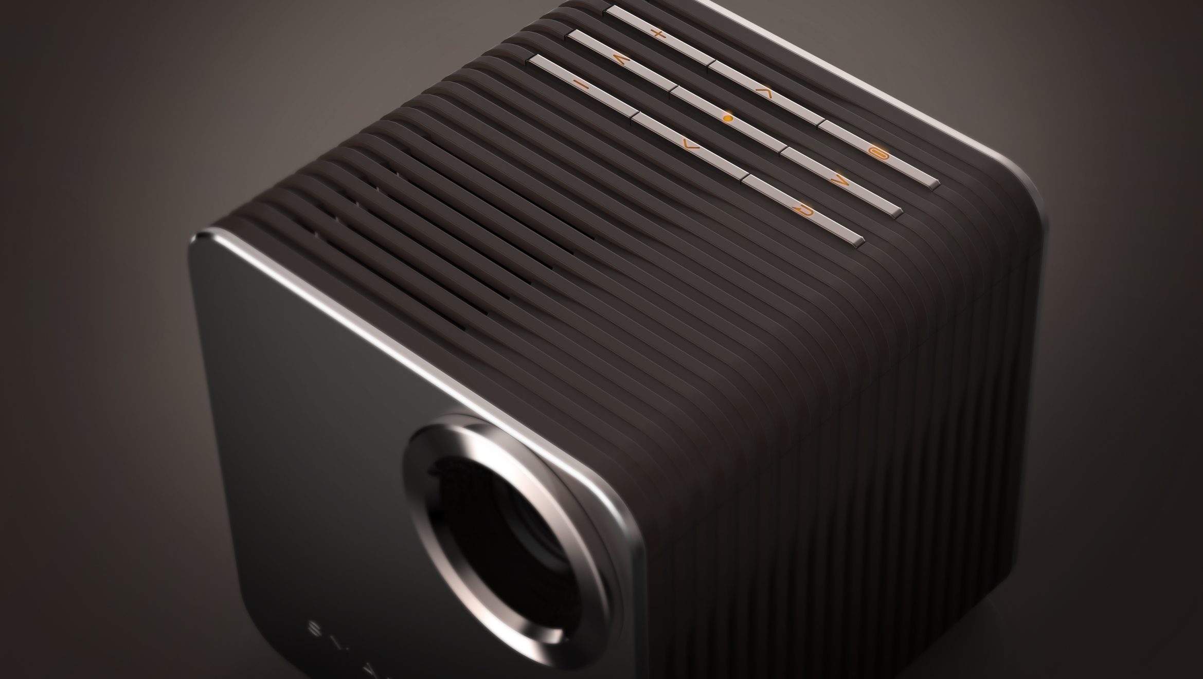
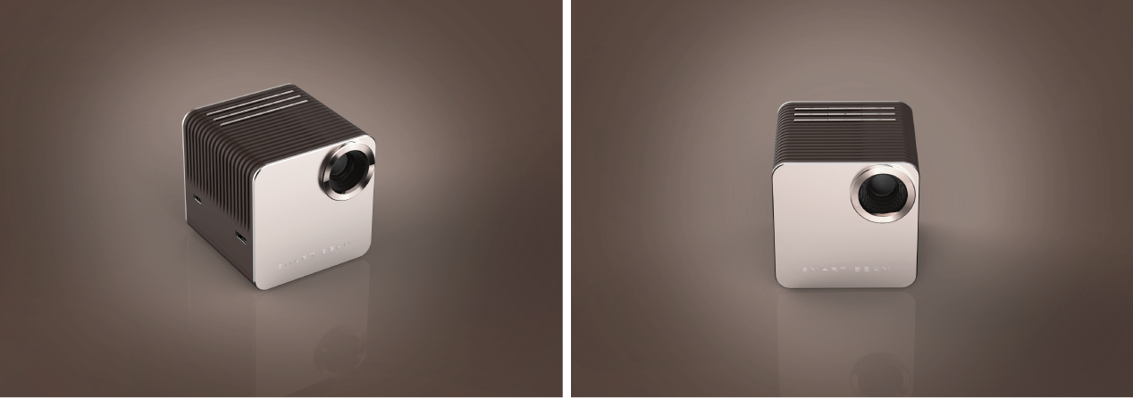
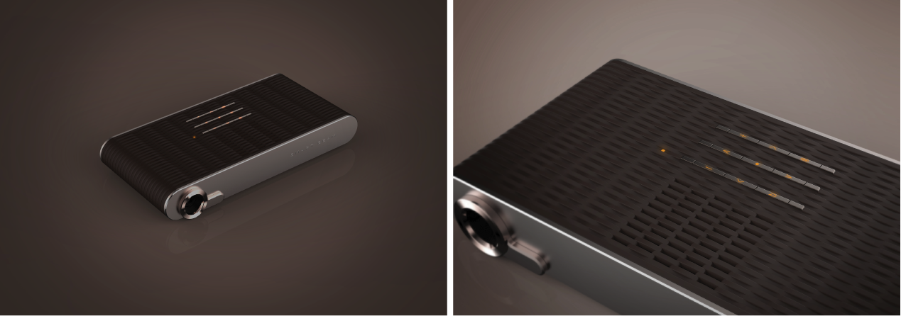
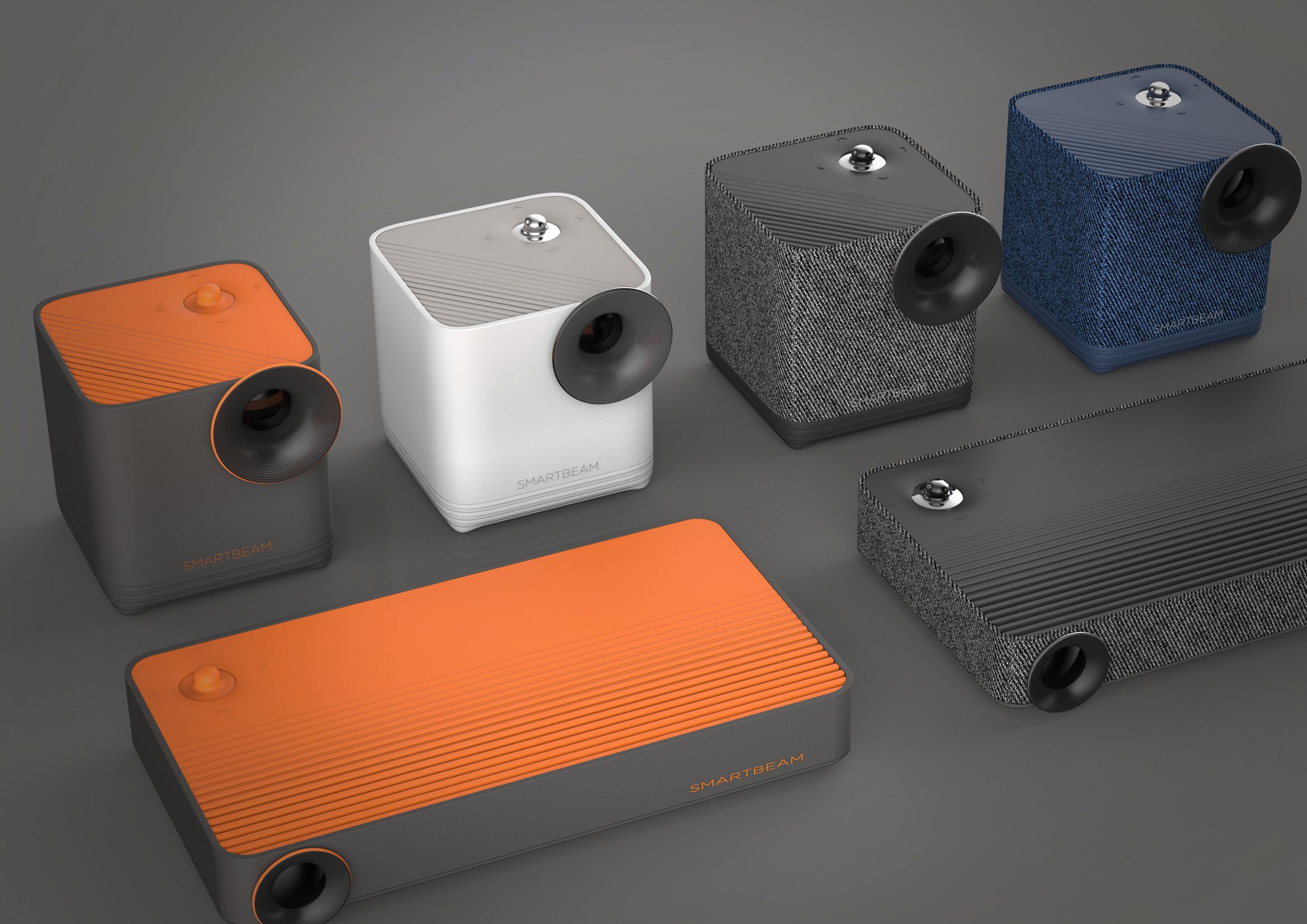
SK Telecom commissioned us to design two versions of form factor (the cube type and the bar type) and requested a design that would give differentiated images to consumers and appeal their expertise while maintaining the existing product identity.
Through the macro social trends, target lifestyle trends, and design trends, etc., we have explored the design improvement direction by excavating the target needs and by analyzing the competitors and usability. Based on the insights from these researches, we have established two design directions of ‘Harmonious Object’ and ‘Refined Solidity’ and carried out the design in two directions.
The design in the direction of ‘Harmonious Object’ was to enlarge the lens part with a soft and warm appearance and to design a humorous jog stick to give the characteristic and to create an iconic image by utilizing sensuous orange-point color.?
The design in the direction of ‘Refined Solidity’ has a sensual but refined and professional feel with a refined, solid feel of metal and a brown color mix match with flexible curves. Talking about the bar type, it is designed to deliver rigidity and luxury through vent details with organized curves.


